What we set out to achieve
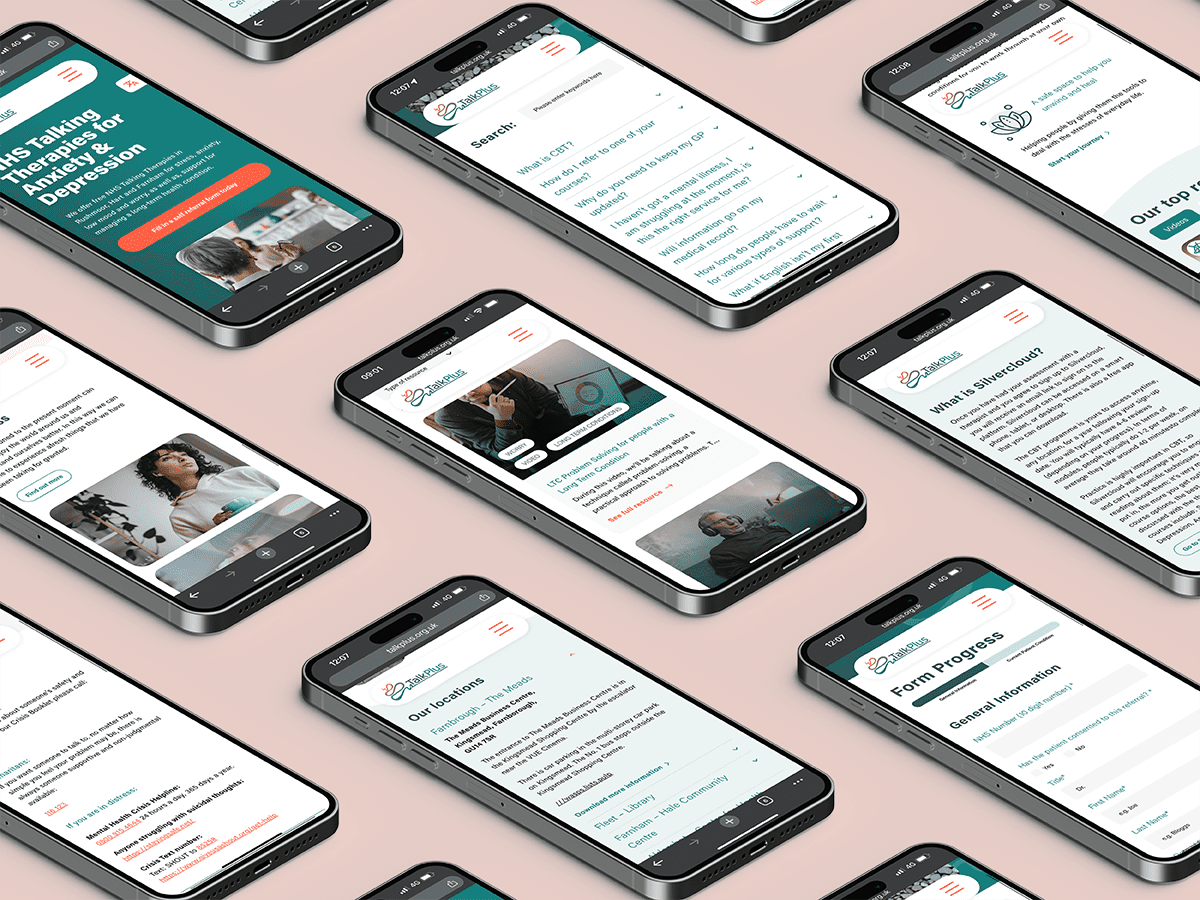
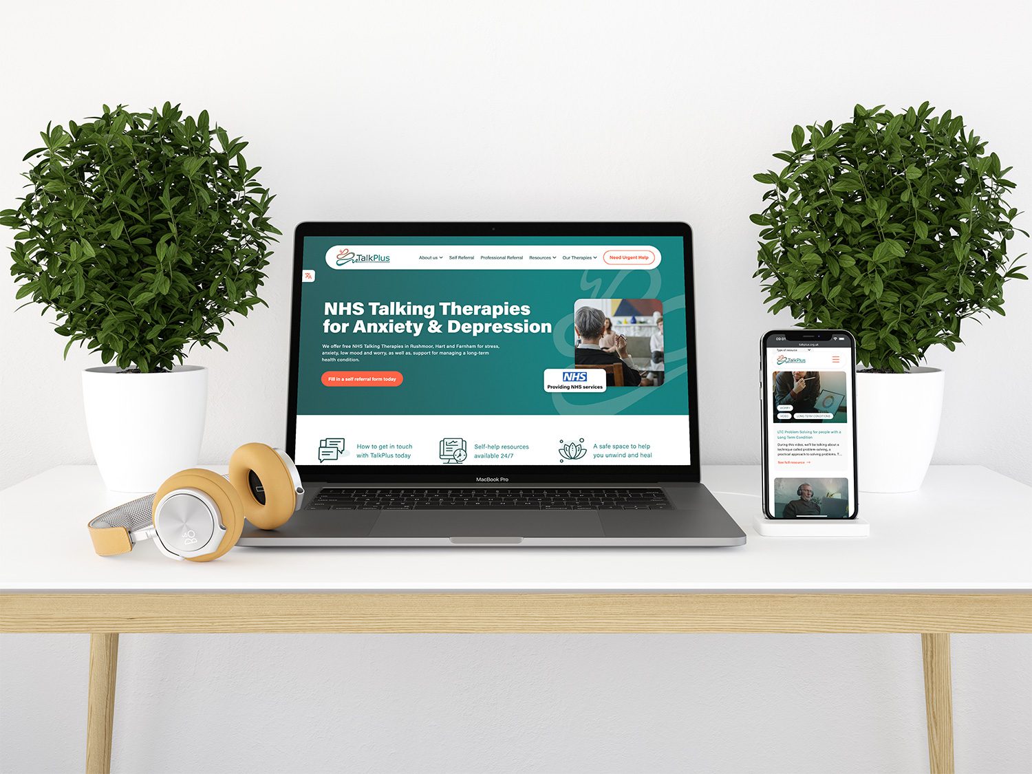
TalkPlus had been suffering with an outdated website that had slowly grown into a bit of a confusing mess for users. They wanted to streamline the user journey and ensure that all users could quickly and easily get to the vital information they might need. While undergoing this website overall TalkPlus also decided that a small refresh to their logo and colour palette might help to modernise the brand.
Branding Update
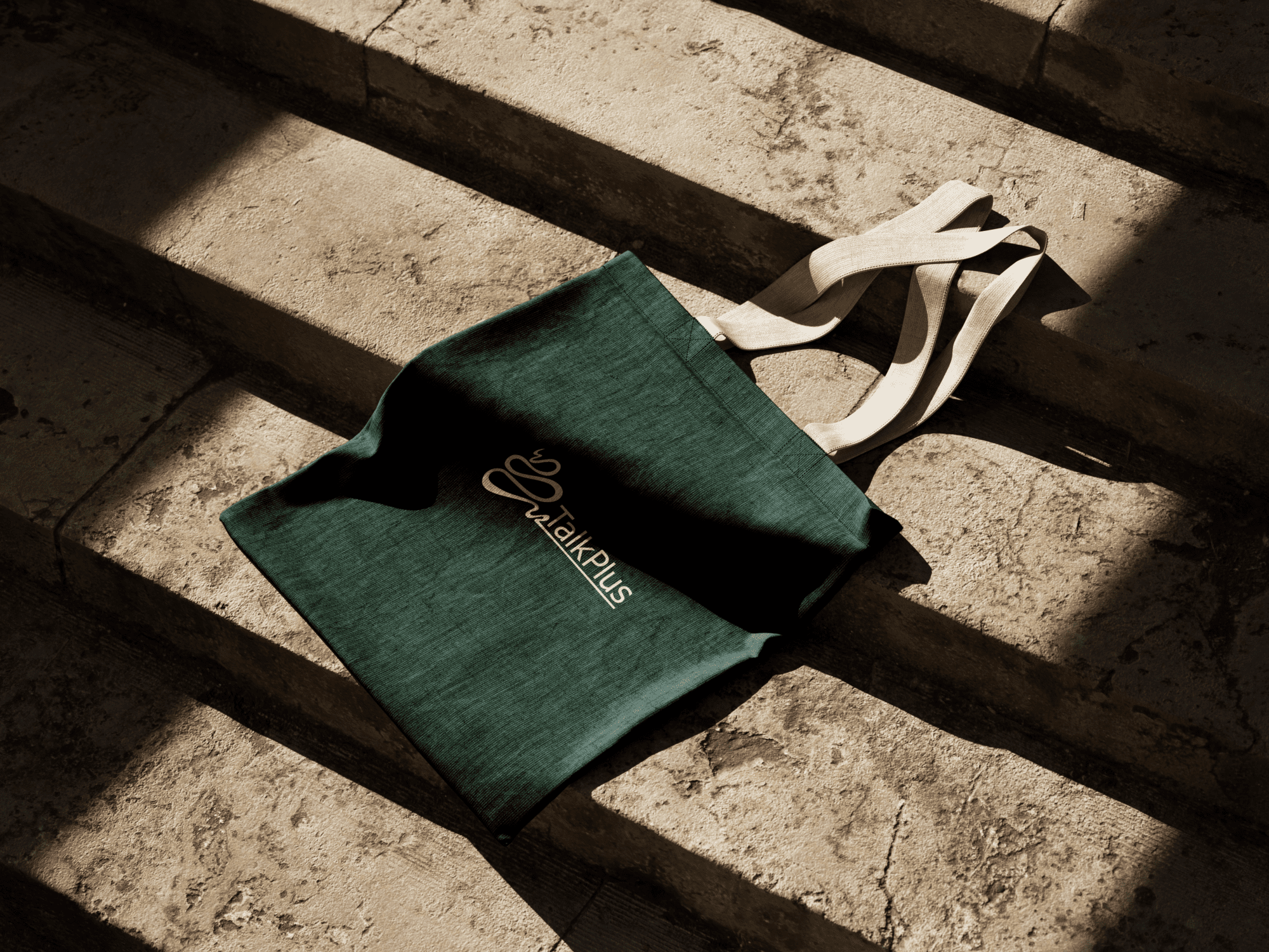
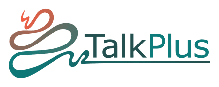
The logo wasn’t in need of any major changes to really make it shine. Our only real changes were to tidy up the “squiggle”, add the new colour palette to the design and ensure that the gradient flowed from the tip of the “squiggle” down to the end of the logo. This flow was an important visual note as it shows the patients journey with TalkPlus starting at one end and slowly improving until the end.
Before – logo

After – logo
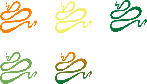
Before – colours
After – colours
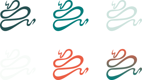
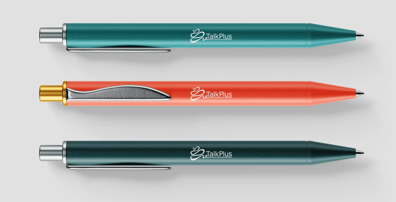
Again the colours didn’t need a radical change but a small nudge away from the bright yellow and green used before. We tried to expand the new palette to create some more branding options in the future. We feel that the more muted greens and teals fit in with the brand a lot better than the brighter original colours.
Website Improvements
We made various improvements to the dated TalkPlus website. Some of the main ones are listed below. However, there are many small changes we have made along the way.
Streamlined Navigation
We restructured and streamlined the entire sites navigation and sitemap to improve user journey.
Filtered Resources
Added a filtered resource page to help users find the relevant information quicker and more easily.
Brand Update
Overhauled the brand colours and typography to ensure higher levels of accessibility.
Translation Widget
Added in improved translations widget for other language users that prefer a different language.
